In the realm of data analysis, histograms stand as invaluable tools for visualizing the distribution and frequency of numeric data.JMP, a renowned statistical software, offers a user-friendly interface and powerful capabilities for constructing histograms. This comprehensive guide will lead you through the intricacies of creating informative histograms using JMP.

Image: community.jmp.com
Understanding Histograms: A Foundation
A histogram is a graphical representation of the distribution of a continuous dataset. It consists of a series of vertical bars, each corresponding to a range of values (also known as “bins”) along the x-axis. The height of each bar indicates the number of data points that fall within that specific bin. Histograms provide valuable insights into the central tendency, spread, and shape of a dataset.
Creating a Histogram in JMP: A Step-by-Step Guide
-
Prepare the Dataset: Import your numeric dataset into JMP. Ensure that the data is appropriately organized and cleaned.
-
Select the Data Column: In the JMP interface, select the column containing the numeric data you wish to analyze.
-
Create a Histogram: Navigate to the “Graph” menu and select “Histogram.” In the Graph Builder window that appears, you will find the selected data column in the “Y, Response” field.
-
Configure Histogram Properties: Customize the histogram’s appearance by adjusting the bin width, the number of bins, and the orientation of the bars. Experiment with different settings to find the optimal representation for your data.
-
Add Additional Visualizations (Optional): To enhance the histogram, consider adding a density curve and/or normal distribution curve. These elements can provide additional insights into the distribution of the data.
-
Interpret the Histogram: Analyze the histogram to identify patterns, trends, and outliers. The histogram should provide insights into the distribution, shape, and any irregularities within the data.
Advanced Histogram Techniques
-
Creating Grouped Histograms: Compare distributions across different groups or categories by using the “By” option in the Graph Builder window. Grouped histograms allow for the visualization of data distribution within each group.
-
Normal Probability Plots: Overlay a normal distribution curve onto the histogram to assess if the data follows a normal distribution. Normal probability plots can reveal deviations from normality and help identify potential outliers.
-
Cumulative Distribution Functions: Create a cumulative distribution function (CDF) plot to visualize the proportion of data points falling below a given value. CDF plots are useful for identifying quantiles and comparing distributions.
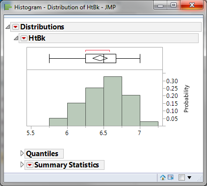
Image: leansigmacorporation.com
How To Make Histogram In Jmp
Conclusion
JMP empowers users to create informative and visually appealing histograms. By following the steps outlined in this guide and exploring advanced techniques, researchers and data analysts can gain deeper insights into the distribution and patterns within their datasets. Remember to supplement your understanding of histograms with further research and experimentation to unlock the full potential of this powerful data visualization tool.


